Designing for Decision: How Veracode Became a Risk Radar
Veracode Security Dashboard is a smart, AI-powered UX solution that helps security teams and developers instantly understand and manage risks across complex systems. Designed for clarity and actionability, it transforms scattered data into a structured, intuitive interface, reducing friction, enabling faster decision-making, and improving compliance outcomes.
01
👀 The Challenge
👀 The Challenge
👀 The Challenge
Despite Veracode’s powerful scanning engine, users struggled to answer a simple question:
“Where are we most at risk, and what should we do next?”
Security managers were overwhelmed. The dashboard showed static lists across fragmented modules, with no clear sense of priority. They couldn’t tell what to fix first, which codebases were at risk, or how to act — slowing triage and draining support resources.
02
🧠 My Role
🧠 My Role
🧠 My Role
As the Principal UX Designer, I initiated a user-centered redesign to turn Veracode from a static analytics tool into a dynamic decision-making system.
As the Principal UX Designer, I initiated a user-centered redesign to turn Veracode from a static analytics tool into a dynamic decision-making system.
As the Principal UX Designer, I initiated a user-centered redesign to turn Veracode from a static analytics tool into a dynamic decision-making system.
03
🎯 Goal
🎯 Goal
🎯 Goal
My goal was to transform a cluttered security tool into a decision-making radar that helped security leaders prioritize threats and act with confidence — cutting triage time and increasing visibility across code assets.
My goal was to transform a cluttered security tool into a decision-making radar that helped security leaders prioritize threats and act with confidence — cutting triage time and increasing visibility across code assets.
My goal was to transform a cluttered security tool into a decision-making radar that helped security leaders prioritize threats and act with confidence — cutting triage time and increasing visibility across code assets.
04
🗣️ Interviews & Insights
🗣️ Interviews & Insights
🗣️ Interviews & Insights
To uncover real user pain, I conducted:
✳️ 1:1 user interviews with internal DevSecOps leads and external security managers
📊 Heuristic evaluation of the dashboard and workflows
📈 Review of usage analytics and drop-off points in triage flows
Key insight:
Security teams weren’t looking for more data. They were looking for clarity, urgency, and focus.
I realized that the core problem wasn’t layout — it was cognition. Users didn’t want to browse data; they wanted to be alerted to what matters. They wanted clarity, not customization.
05
🔍 Desk Research
🔍 Desk Research
🔍 Desk Research
Before wireframing, I benchmarked dashboards from Snyk, GitHub Security, and Checkmarx. Most were data-heavy, but few helped users decide what to act on. The mental model often assumed users were experts — not developers juggling tickets.
We mapped out:
Common patterns (scan status, CVSS filters, heatmaps)
Frequent issues (information overload, unclear priorities)
Missed opportunities (AI insights, smart grouping, role-based views)
The gap? “Users didn’t need more data — they needed clarity and guidance.”
✍🏻 Assumptions
Most dashboards are too technical for broader teams
Better mental models = less hesitation
Smart defaults and AI grouping can ease navigation
❓Unknowns
How much context is enough before it overwhelms?
Should we tailor views by role, or let users choose?
07
📊 Pendo Analytics
📊 Pendo Analytics
📊 Pendo Analytics
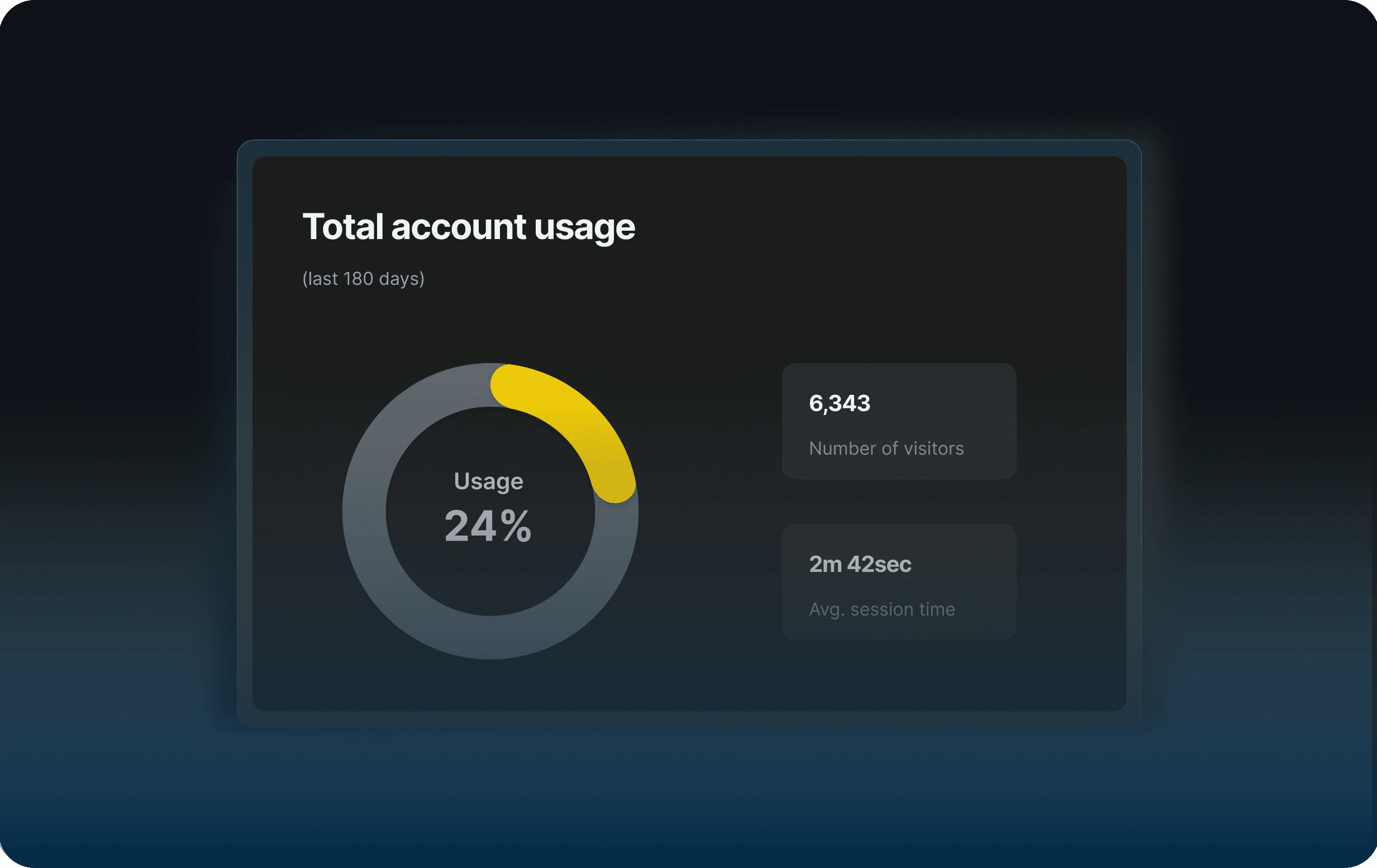
Usage data told us what interviews couldn’t:
Only 24% of users used the dashboard in the last 6 months.
Despite being the product's entry point, it was underused — and those who visited spent just 2m 42s on average.
📉 Quick stats:
1,336 active users
5,494 skipped it
6,343 had access
Clearly, users didn’t see value — or didn’t know how to use it.
✍🏻 Assumptions
Awareness isn’t the problem — usefulness is
The dashboard lacks clear guidance and actionable value
Improving clarity and focus could lift engagement
❓Unknowns
Why do 75% of users skip it entirely?
Are blockers technical, strategic, or UX-related?
08
🏃🏻♀️ Design Sprint
🏃🏻♀️ Design Sprint
🏃🏻♀️ Design Sprint
I proposed a full redesign of the Risk Dashboard — and aligned cross-functional teams through a 5-day Design Sprint that I led. We brought together cross-functional leaders from product and cybersecurity, mapped pain points, defined a new mental model (“risk radar”), and co-created a new triage flow. This alignment unlocked buy-in early and de-risked the execution phase.
I proposed a full redesign of the Risk Dashboard — and aligned cross-functional teams through a 5-day Design Sprint that I led. We brought together cross-functional leaders from product and cybersecurity, mapped pain points, defined a new mental model (“risk radar”), and co-created a new triage flow. This alignment unlocked buy-in early and de-risked the execution phase.
I proposed a full redesign of the Risk Dashboard — and aligned cross-functional teams through a 5-day Design Sprint that I led. We brought together cross-functional leaders from product and cybersecurity, mapped pain points, defined a new mental model (“risk radar”), and co-created a new triage flow. This alignment unlocked buy-in early and de-risked the execution phase.
09
📏 Personas & IA
📏 Personas & IA
📏 Personas & IA
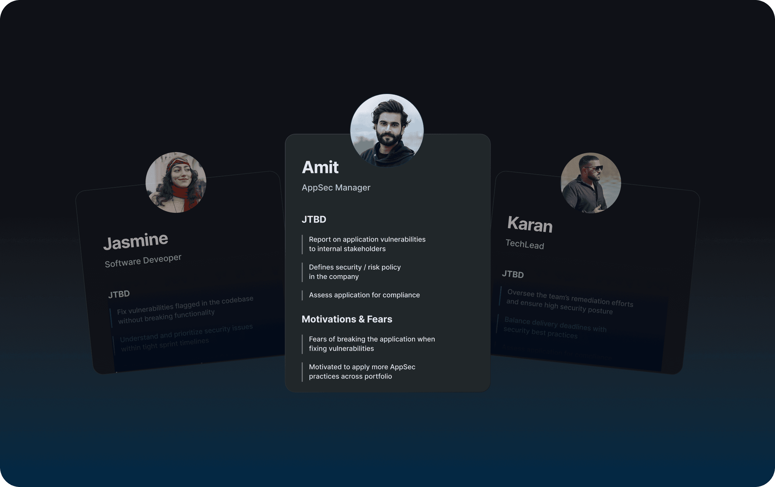
Our design decisions were rooted in real user jobs-to-be-done:
Amit (AppSec Manager): needs policy visibility + risk clarity
Jasmine (Dev): wants to fix without breaking anything
Karan (Tech Lead): balances delivery speed with security posture
We restructured the IA to support how they actually think—grouping by assets, environments, and policies, not scan types.
📌 See full IA map
10
🗺️ User Journey
🗺️ User Journey
🗺️ User Journey
What we uncovered was a fragmented experience. Users had to jump between tools just to answer simple questions like:
“What’s our risk exposure?” or “What should I fix first?”
We mapped a streamlined journey with four core moments:
→ Define scan targets
→ View overall security posture
→ Identify top fixes
→ Track progress across teams
It didn’t just align the team — it became our North Star for building a tool that thinks like its users.
11
🎨 Sketches
🎨 Sketches
🎨 Sketches
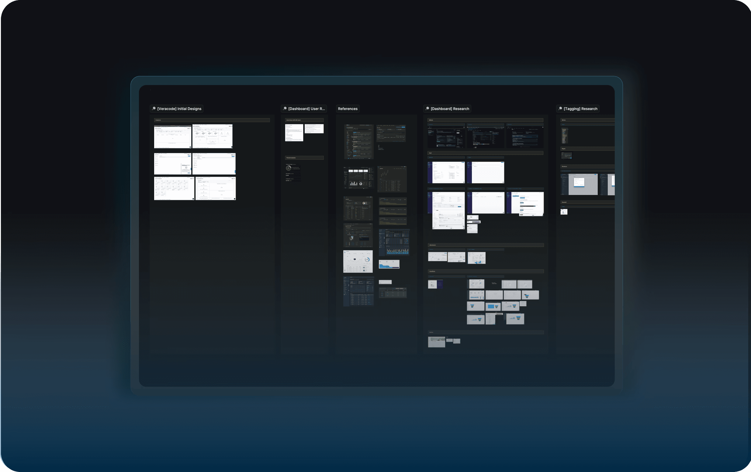
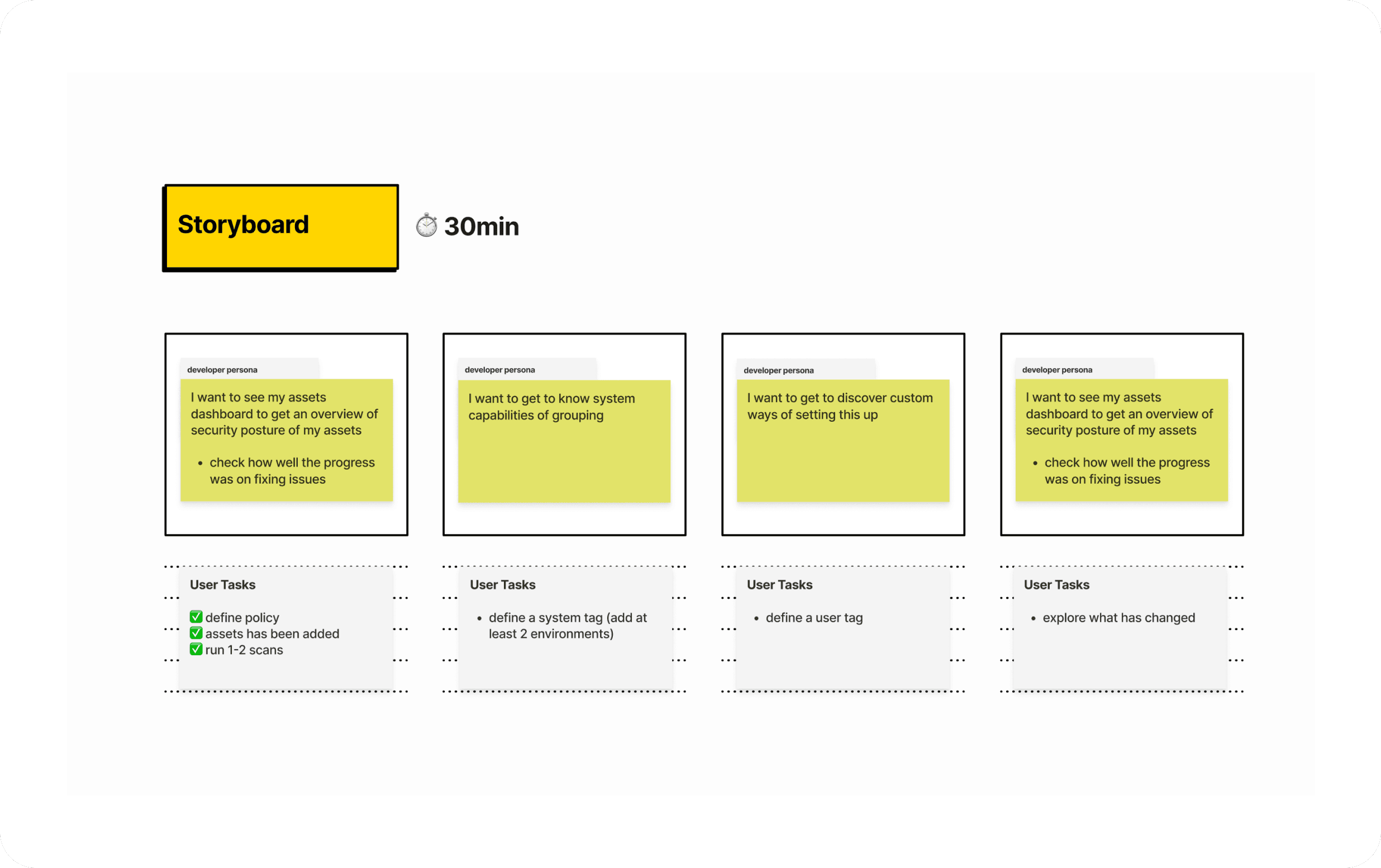
To kickstart ideation, we sketched out early dashboard concepts and task flows—exploring how users might tag, group, and explore assets by severity, policy, or environment.
🧠 From here emerged:
The idea of assigning risk scores per stage (Dev/Test/Prod)
A map-like structure for navigating asset relationships
Concepts for tagging, filtering, and visualizing policy posture
💡 These quick sketches helped us align on mental models and test complexity before committing to hi-fi work.
12
🚶🏻♀️ Interactive Prototype
🚶🏻♀️ Interactive Prototype
🚶🏻♀️ Interactive Prototype
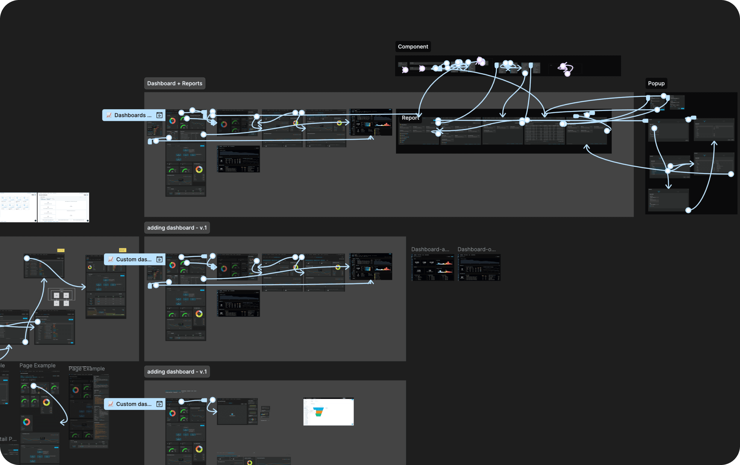
Based on user flows and selected concepts, we created an interactive prototype to test clarity and flow across screensm—from high-level dashboards to asset drill-downs.
🔄 Iterated on:
Navigation between dashboards, reports, and components
How risk context follows the user across views
Ways to surface urgency and prioritize tasks in fewer clicks
✅ Result: faster user orientation, clearer priorities, and sharper UX signals for security leads and developers alike.
13
🧪 User Testing
🧪 User Testing
🧪 User Testing
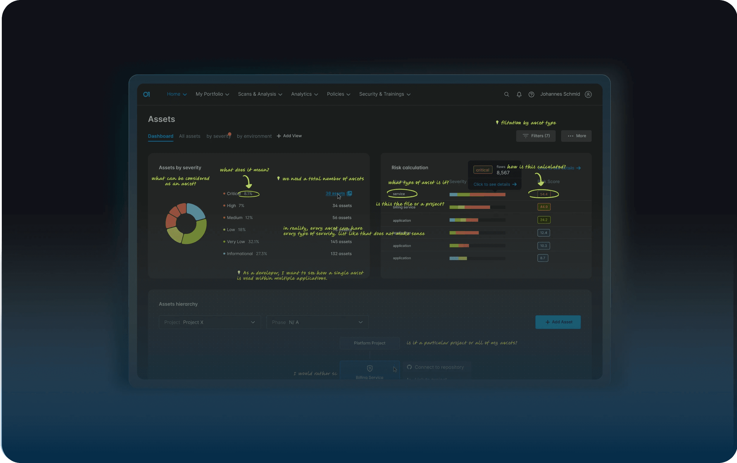
To validate these concepts, we ran 1:1 tests with security managers and engineers.
We uncovered gaps in our asset definition and clarified how risk scoring is explained.
We asked participants to think aloud while navigating the new layout, drilling into risks, and exploring how assets were grouped and prioritized.
💬 Common feedback:
“I used to feel blind when looking at the dashboard. Now I actually know what’s going on.”
14
Security Overview Panel
Security Overview Panel
Security Overview Panel
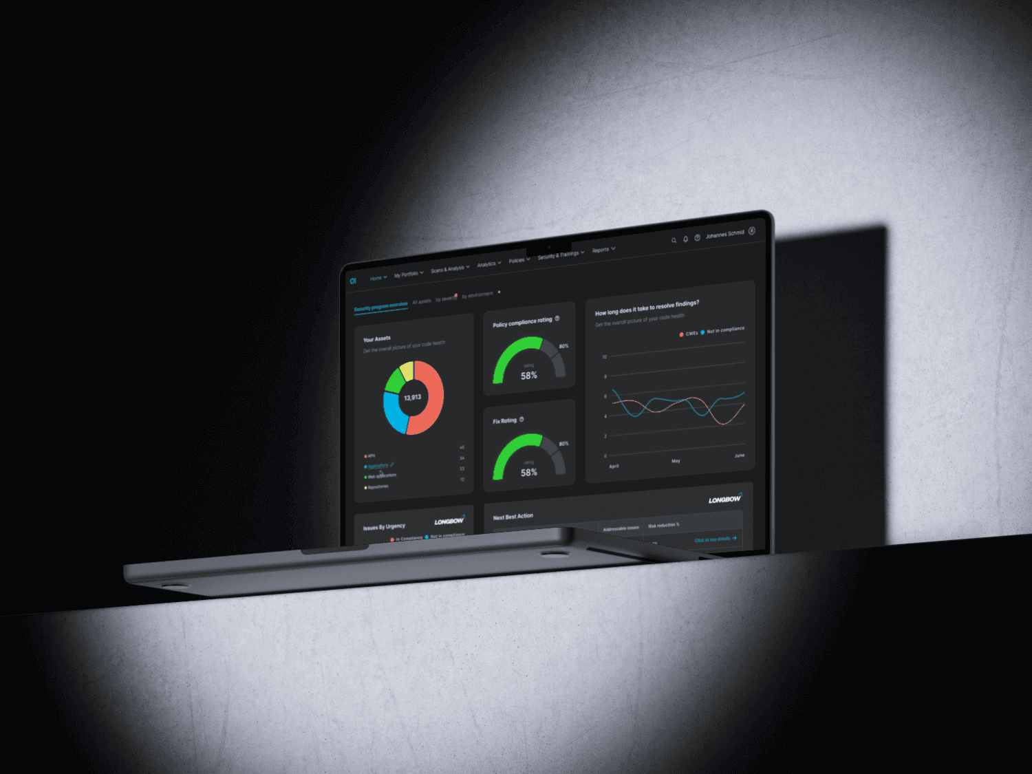
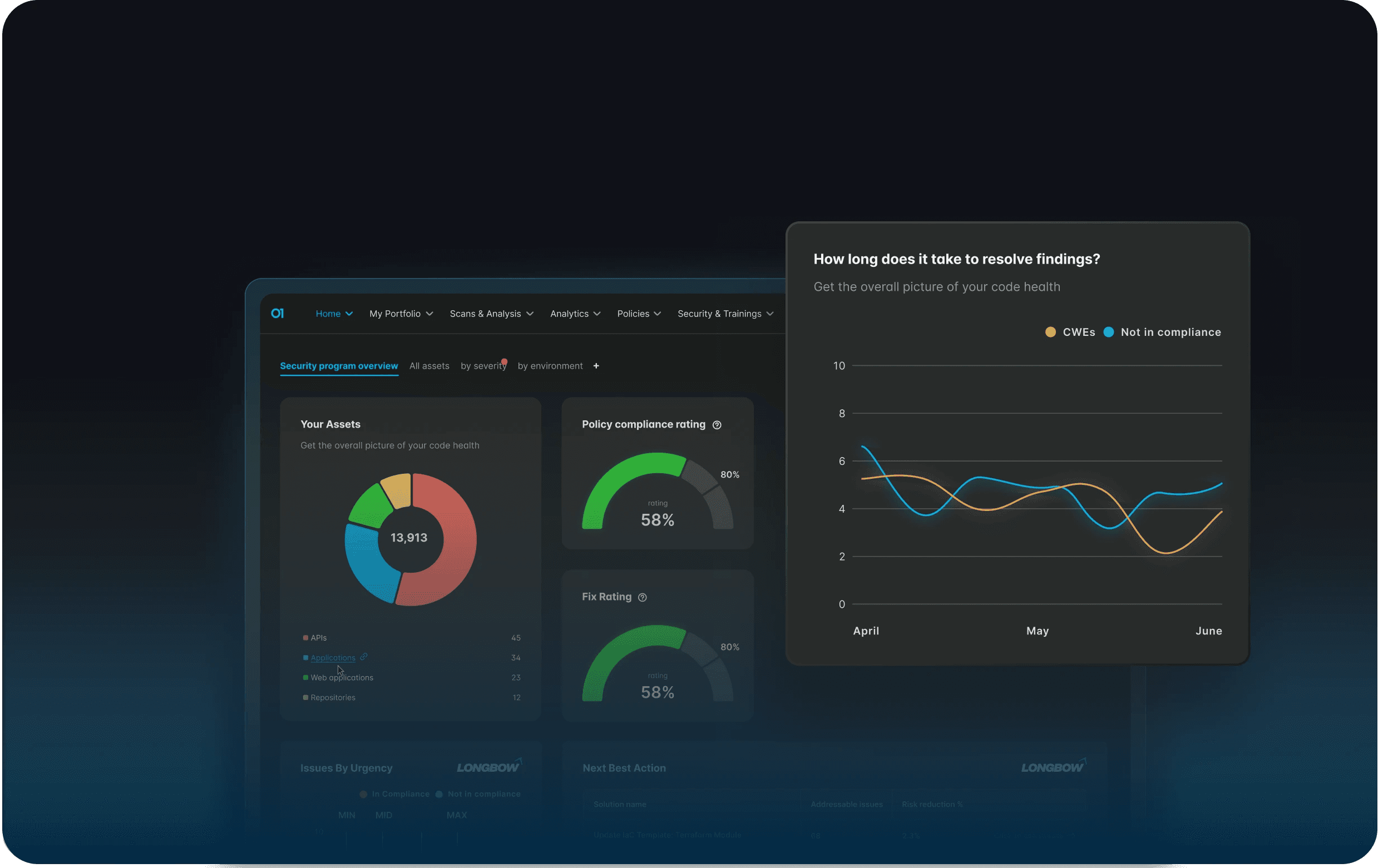
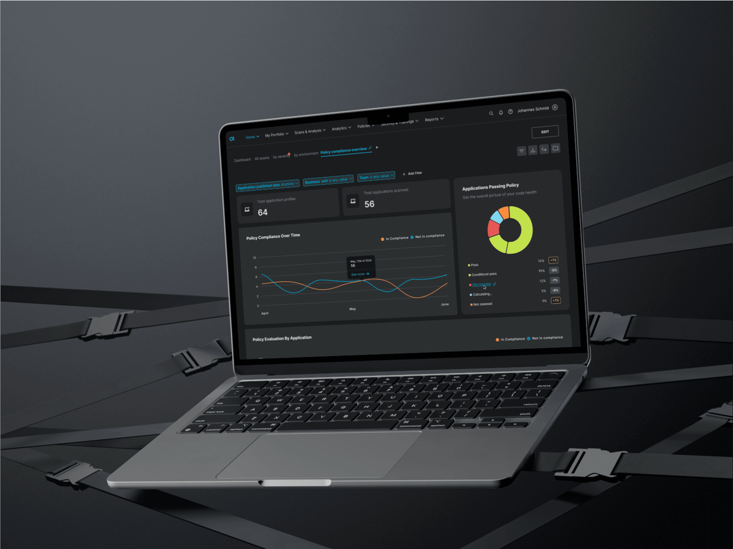
"I want to see my assets dashboard to get an overview of security posture."
What we built:
A quick-glance dashboard that gives security leads like Amit a high-level picture of where their organization stands. No more hunting across tabs.
Asset breakdown by severity
Fix rate + policy compliance score
Visual trend lines: how posture is evolving
Grouped by environment, project, or scan type
🧠 AI Opportunity:
“If fix rate continues, your posture will improve by 24% in the next 2 weeks.”
✳️ Helps leaders report progress and plan next steps—without needing to open 5 tools.
15
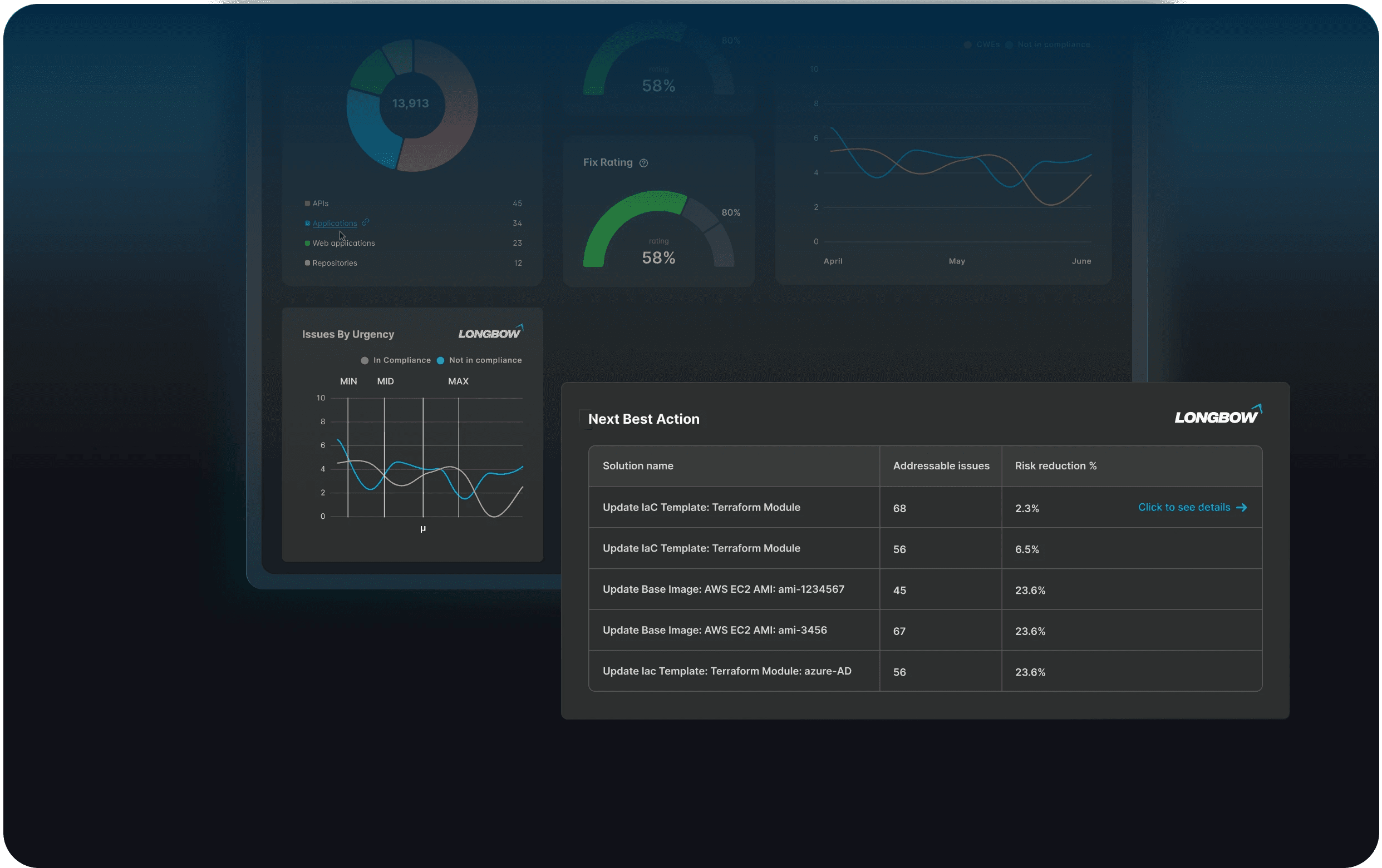
Next Best Action Module (AI-Powered)
Next Best Action Module (AI-Powered)
Next Best Action Module (AI-Powered)
"I want to know what to fix first."
What we built:
An AI-driven guidance system that highlights the top tasks with the most risk reduction impact.
Table view: actionable issues, linked to projects
Smart ranking: based on severity, asset value, environment sensitivity
Clear “next step” suggestions built right into the UI
✨ Foundation for future AI automation of risk triage & task assignment.
🔹 Users reduced triage time from 30min → 12min per incident.
“It finally feels like I can take action—not just stare at issues.” — AppSec Manager
16
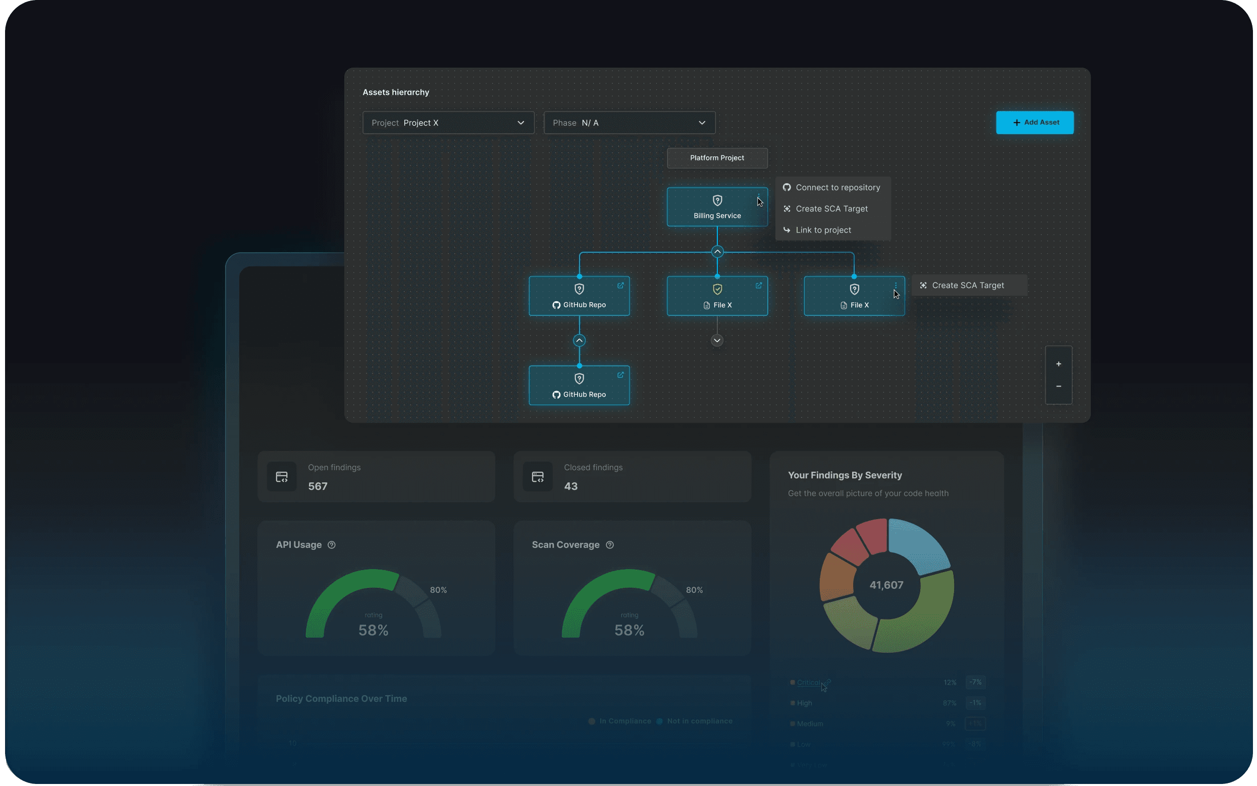
Asset Hierarchy & Tagging
Asset Hierarchy & Tagging
Asset Hierarchy & Tagging
"I want to group and explore assets based on how my org is structured."
What we built:
An interactive asset map with smart tagging, so engineers and tech leads can actually see the structure they think in.
Visual breakdown: platform → repo → environment
Group by team, project, tag
Create & edit tags for quick filtering
🧠 AI Opportunity:
“Based on past tagging, this asset may belong to Finance apps.”
🔹 Less chaos, more clarity. Teams stopped relying on spreadsheets to manage their systems.
17
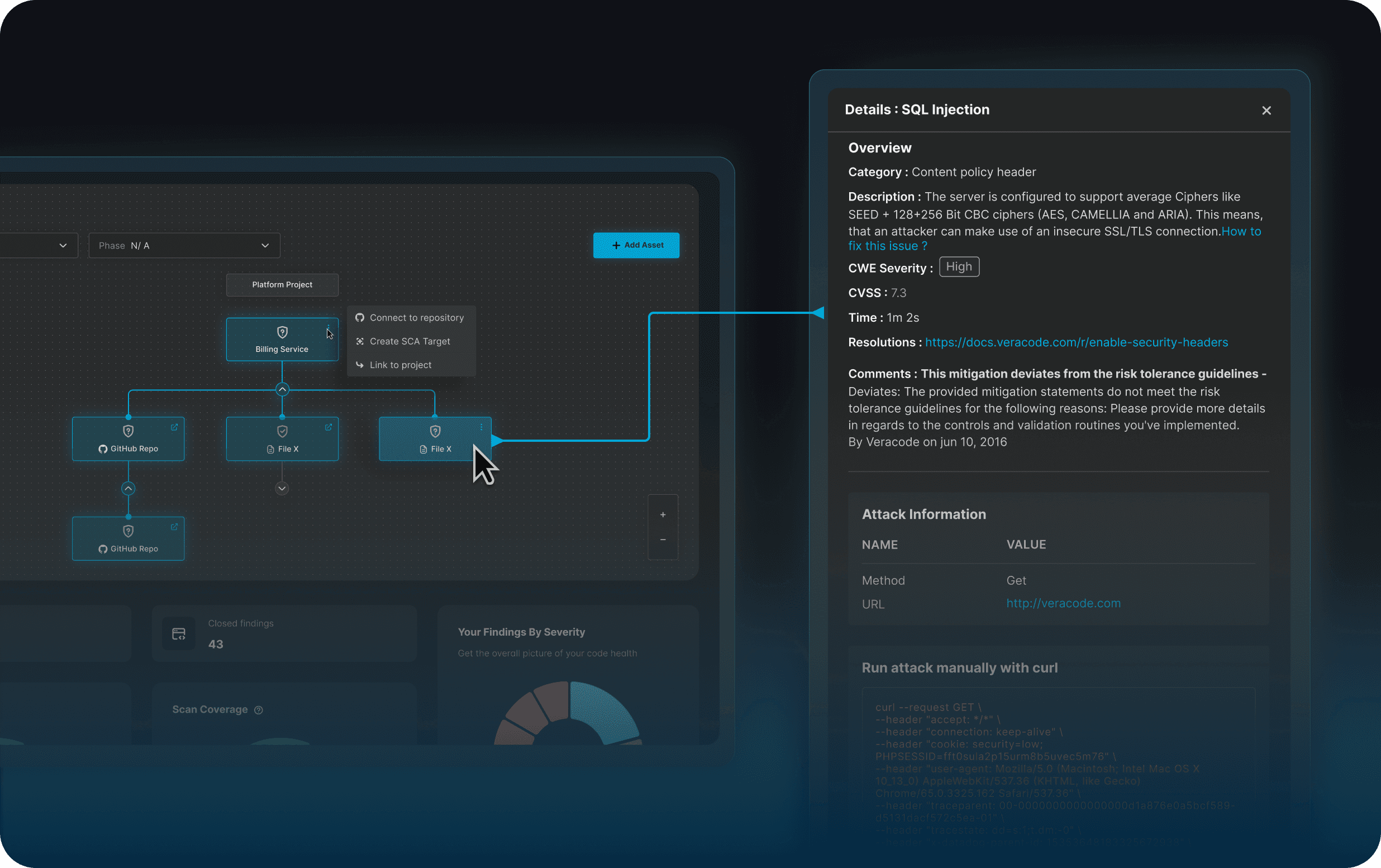
Drill-Down Explorer
Drill-Down Explorer
Drill-Down Explorer
"I want to know why this area is considered high-risk."
What we built:
Click-through navigation from org-level to asset-specific vulnerabilities—so developers like Jasmine don’t get lost in the noise.
Visual map of risk clusters
Policy view with pass/fail breakdown
View trends over time to spot repeat issues
🧠 AI Opportunity:
“These 3 assets share a common failure cause: outdated encryption libraries.”
🔹 Devs finally had the context they needed to fix without guesswork.
18
📈 Impact
📈 Impact
📈 Impact
🔹 Confidence in the dashboard rose across roles
🔹 Post-test surveys showed +40% clarity improvement in “understanding risk”
🔹 Triage speed (on repeat tasks) improved by 2×
🔹 Most common quote:
“Now I finally know what this means—and what to fix.”
🔹 Confidence in the dashboard rose across roles
🔹 Post-test surveys showed +40% clarity improvement in “understanding risk”
🔹 Triage speed (on repeat tasks) improved by 2×
🔹 Most common quote:
“Now I finally know what this means—and what to fix.”
🔹 Confidence in the dashboard rose across roles
🔹 Post-test surveys showed +40% clarity improvement in “understanding risk”
🔹 Triage speed (on repeat tasks) improved by 2×
🔹 Most common quote:
“Now I finally know what this means—and what to fix.”
19
💬 Outcome
💬 Outcome
💬 Outcome
In post-launch feedback, security leads described the tool as “actionable,” “calming,” and “finally usable for real decision-making.” For me, the win was seeing risk management feel less risky.
For me, the win wasn’t a cleaner UI.
It was building something that made complex decisions feel simple—and safe.
20
🧑🏻🎓 Lessons Learnt
🧑🏻🎓 Lessons Learnt
🧑🏻🎓 Lessons Learnt
This wasn’t just a redesign. It was a strategic shift in how Veracode communicates risk.
I learned how to:
Lead through ambiguity with structure (Design Sprints as alignment tools)
Translate enterprise complexity into user mental models
Balance technical depth with UX simplicity, without sacrificing credibility
If I were to revisit this project, I’d align how each tool defines and organizes risks from the start — so users don’t have to learn a new language every time they switch views
21
✍️ TL;DR
✍️ TL;DR
✍️ TL;DR
The Ask: Make Veracode’s dashboard more intuitive, actionable, and unified.
The Insight: Users don’t want data—they want direction.
The Outcome: A redesigned “risk radar” experience that improves clarity, confidence, and cross-functional alignment.
The Ask: Make Veracode’s dashboard more intuitive, actionable, and unified.
The Insight: Users don’t want data—they want direction.
The Outcome: A redesigned “risk radar” experience that improves clarity, confidence, and cross-functional alignment.
The Ask: Make Veracode’s dashboard more intuitive, actionable, and unified.
The Insight: Users don’t want data—they want direction.
The Outcome: A redesigned “risk radar” experience that improves clarity, confidence, and cross-functional alignment.
22
🧑🏻🎓 Lessons Learnt
🧑🏻🎓 Lessons Learnt
🧑🏻🎓 Lessons Learnt
This wasn’t just a redesign. It was a strategic shift in how Veracode communicates risk.
I learned how to:
Lead through ambiguity with structure (Design Sprints as alignment tools)
Translate enterprise complexity into user mental models
Balance technical depth with UX simplicity, without sacrificing credibility
If I were to revisit this project, I’d align how each tool defines and organizes risks from the start — so users don’t have to learn a new language every time they switch views
//
O L E N A H O R B A C H E N K O
+420607728765
//
olena.horbachenko@gmail.com
©
FOP Horbachenko Olena Valeriivna, Tax Number 3604100281
Kvituchii 35, Dergachi, Kharkiv region, Ukraine
//
O L E N A H O R B A C H E N K O
+420607728765
//
olena.horbachenko@gmail.com
©
FOP Horbachenko Olena Valeriivna,
Tax Number 3604100281
Kvituchii 35, Dergachi, Kharkiv region, Ukraine
//
O L E N A H O R B A C H E N K O
+420607728765
//
olena.horbachenko@gmail.com
©
FOP Horbachenko Olena Valeriivna, Tax Number 3604100281
Kvituchii 35, Dergachi, Kharkiv region, Ukraine